Taipei Performing Arts Center
A physical and digital recreation of NL Architects' submission for the 2008 Taipei Performing Arts Center competition.
ROLE
Primary constructor for the first physical build, the exterior shell of the second build, and 90% of 3D modelling and digital renderings.
team
Emily C., Adrienne L., Carmen L., Nicole M., with support from session instructor.
DURATION
Six weeks.
Overview
In 2008, an international competition was launched with the objective of finding a design for the upcoming Performing Arts Center in Taipei. The venue required three theatre spaces to support operas and various art performances. NL Architects, a Dutch-based architectural firm submitted a proposal that explored the ideas of a physical structure inspired by a tabletop.
The four 'legs' of the building would create a central void, allowing the an 'exterior' public space to be integrated into its core. The competition winners were crowned to another Dutch-based firm, OMA, and the performing arts center has now been built to their design.
As part of a Spatial Design course, I worked in a group with four others to explore the submission from NL Architects for the Taipei Performing Arts Center. Our timeline of six weeks were split between research (1 week), prototyping (3 weeks), and digital rendering (2 weeks). My role was primarily dedicated to the first physical prototype, the exterior of the second prototype, and 90% of the 3D modelling and rendering of the buildings.
Rendering
The vision from NL Architects
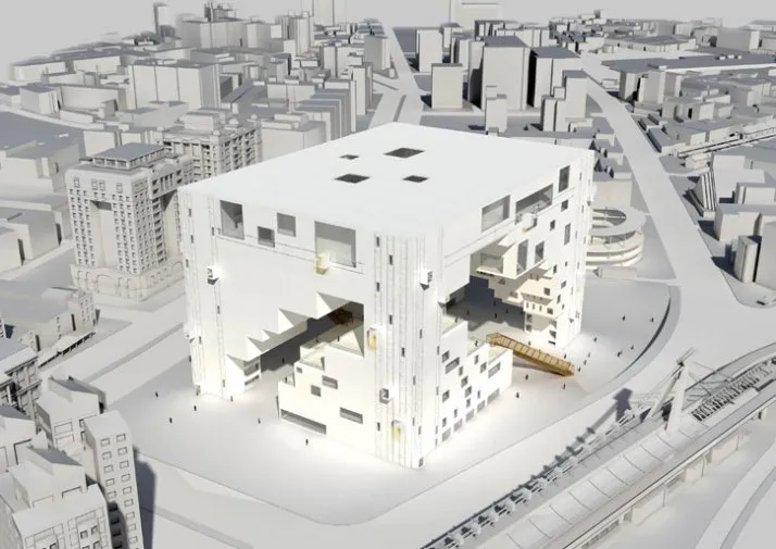
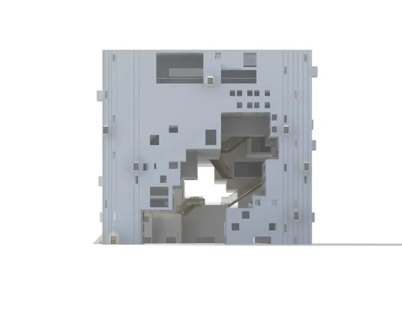
Below are a series of renderings submitted by NL Architects. The form of the structure was heavily influenced by their consideration of spaces that are public and private, creating nooks and crannies that lend to hiding and exposing facets of building in view. The unique distribution of space on elevated floors also lend to their contrasting theme of public and private, putting the building's inhabitants and visitors at the forefront.
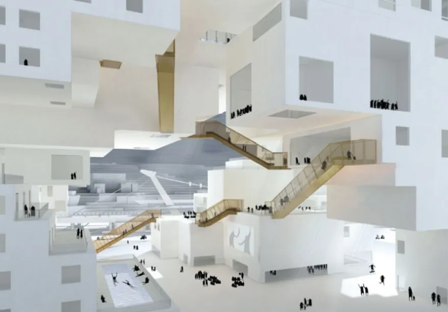
NL Architects (Northeast view)
NL Architects (Northwest view)
NL Architects (North view)
NL Architects (East view)
NL Architects (South view)
NL Architects (West view)
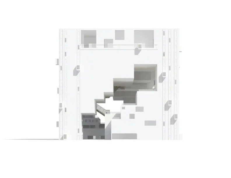
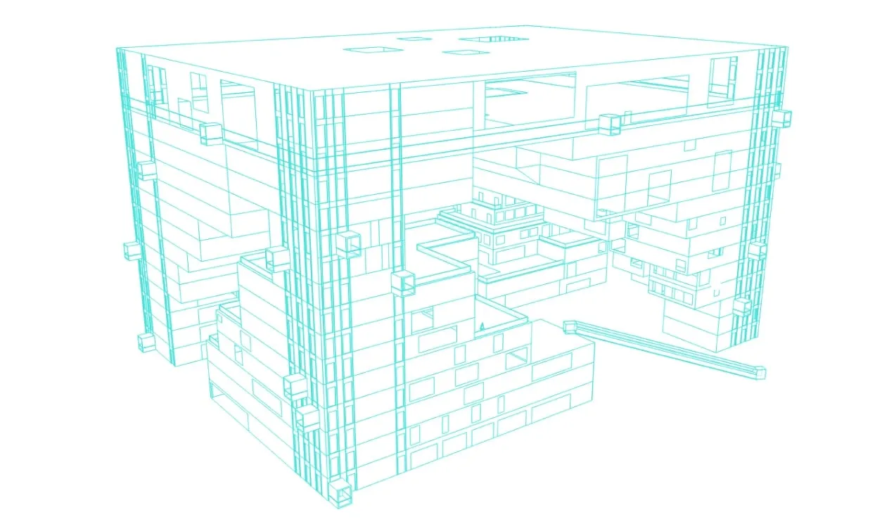
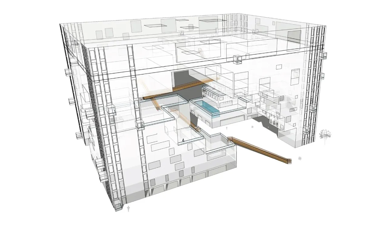
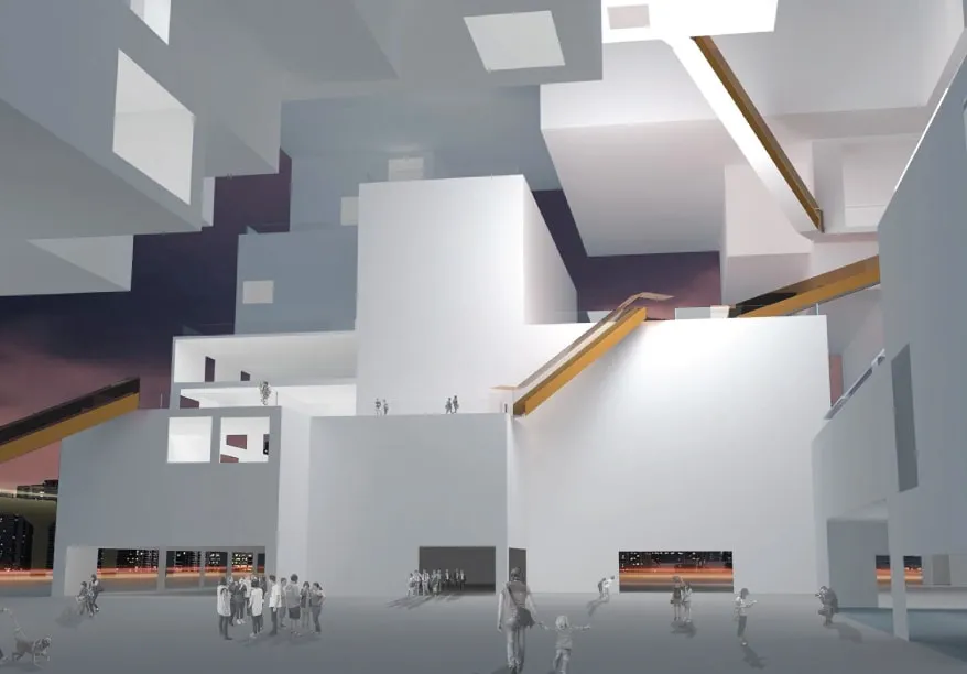
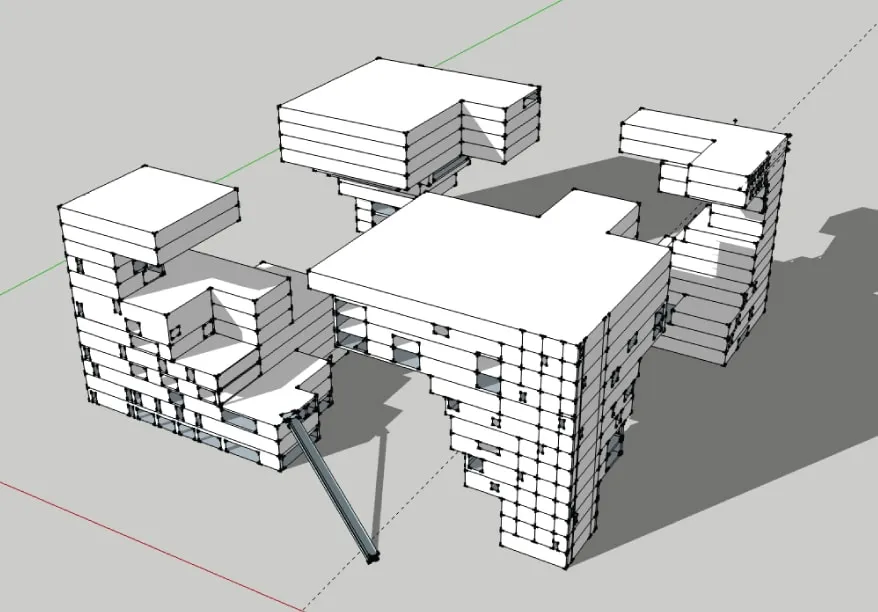
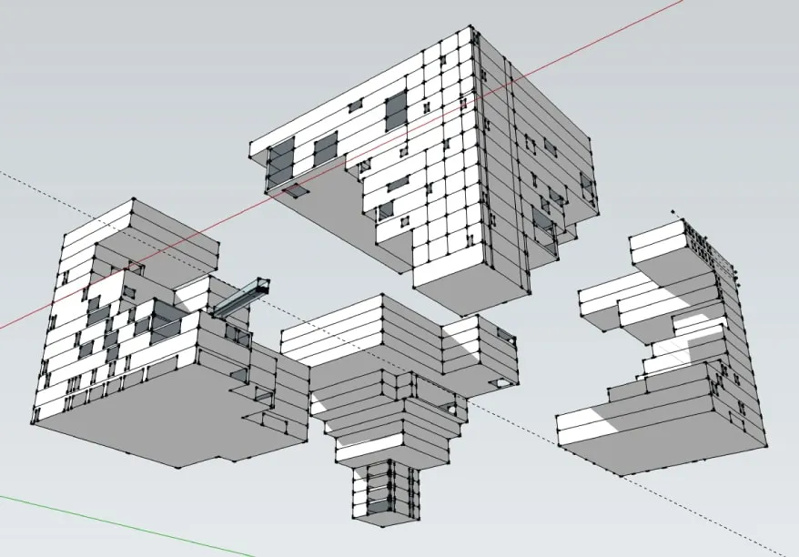
Our line renderings
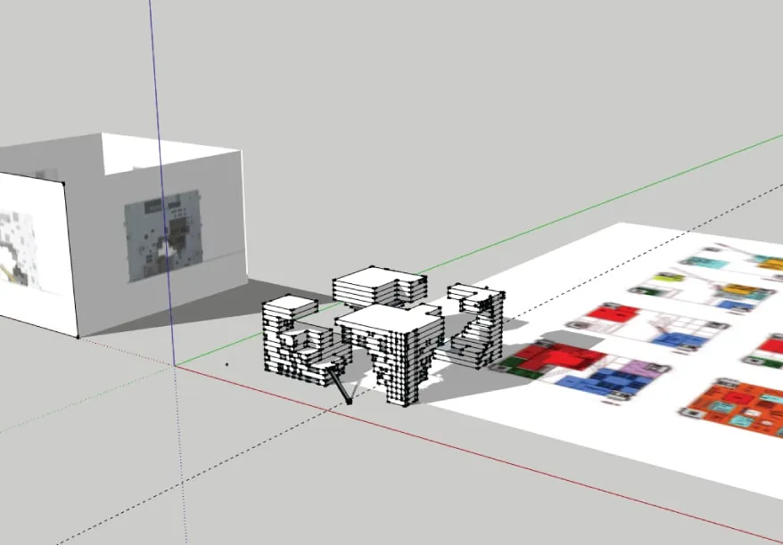
We created our digital model using Google SketchUp and rendered using V-Ray. We also experimented with different rendering styles to see which would best illustrate a compare and contrast from our exploration.
These line renderings had a functional purpose of allowing us to observe construction and faults in our model, whether that was scale, misaligned edges, floors, or corners. But also, it was pretty darn cool.
These line renderings had a functional purpose of allowing us to observe construction and faults in our model, whether that was scale, misaligned edges, floors, or corners. But also, it was pretty darn cool.
Our rendering (Southeast view)
Our rendering (Southeast view)
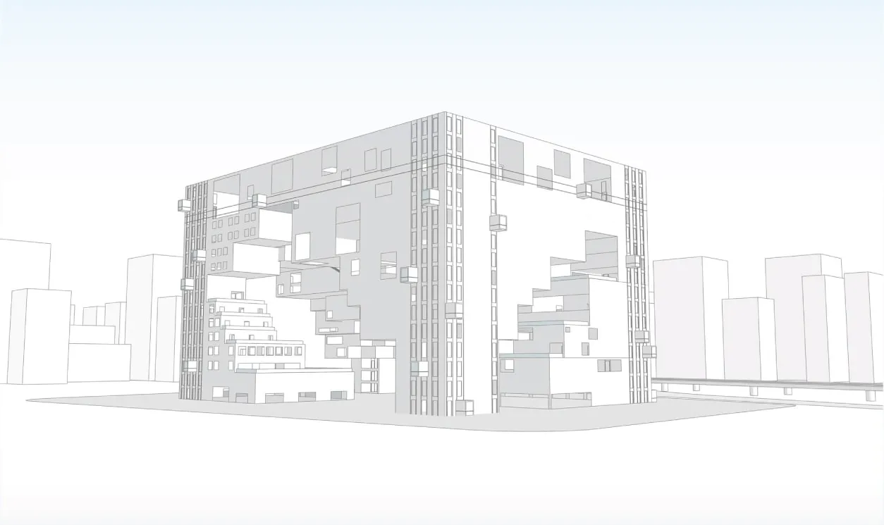
Our rendering (Southwest view)
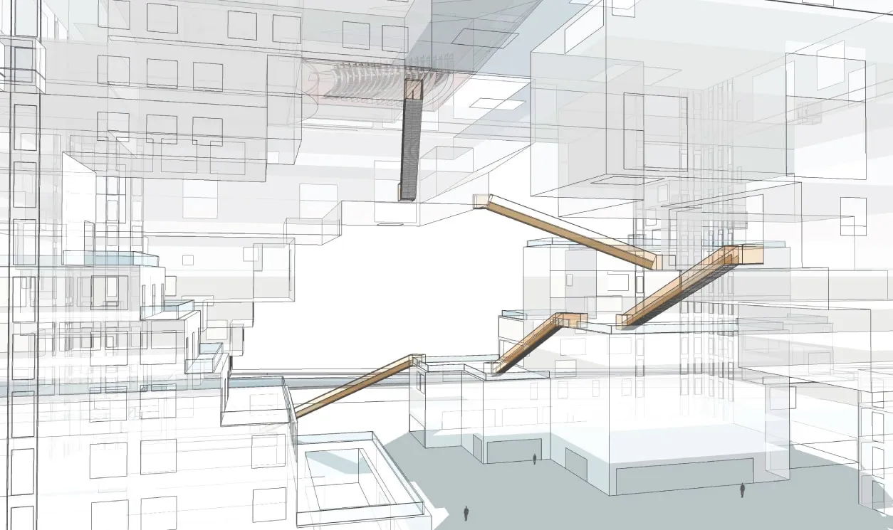
Our rendering (West interior)
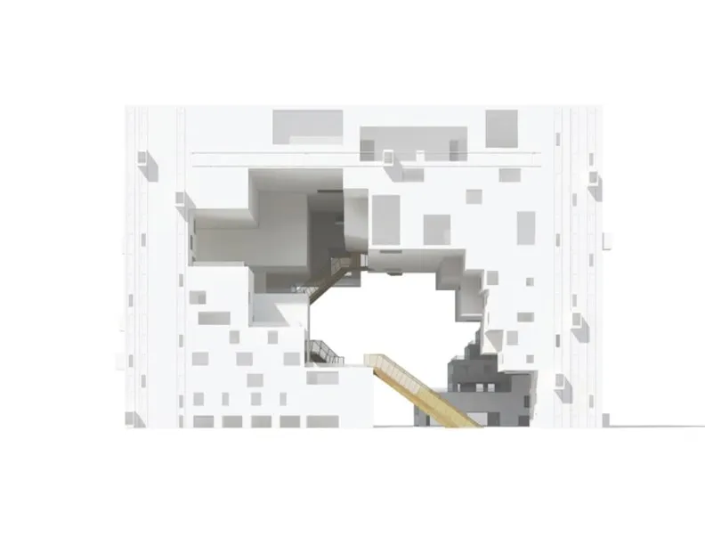
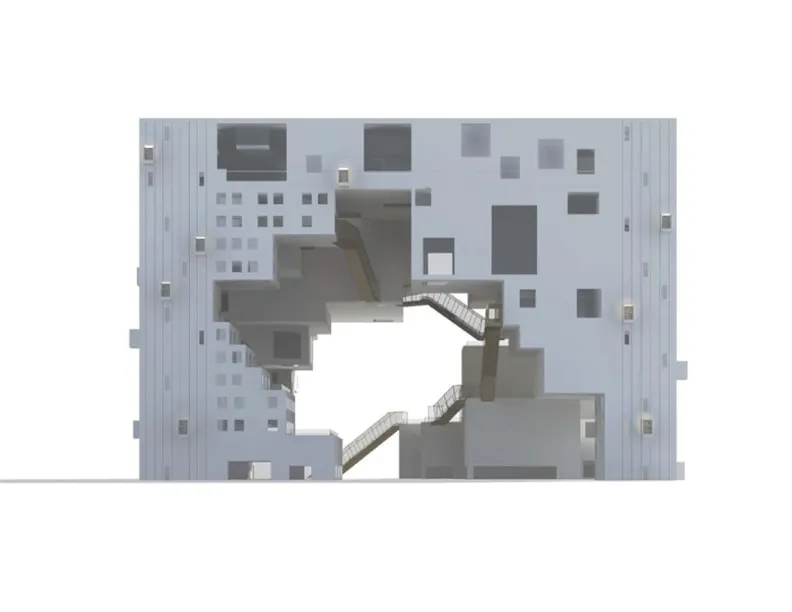
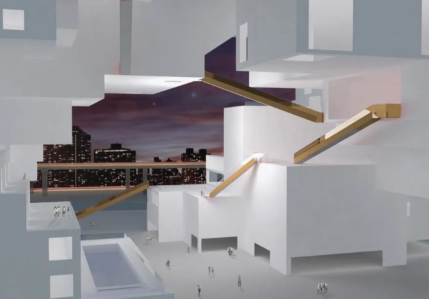
Our digital renderings
Our digital model was heavily supported by our research on existing artifacts and renderings that NL Architects had included in their submission. As their proposal was never brought to life, our construction was based off of informed guestimates from blurry blueprints we found, which came with its own implications in construction. However, we were able to map the four exterior faces while interpolating the dimensions of the floor plans, which allowed us to create our take on the structure from what we could piece together.
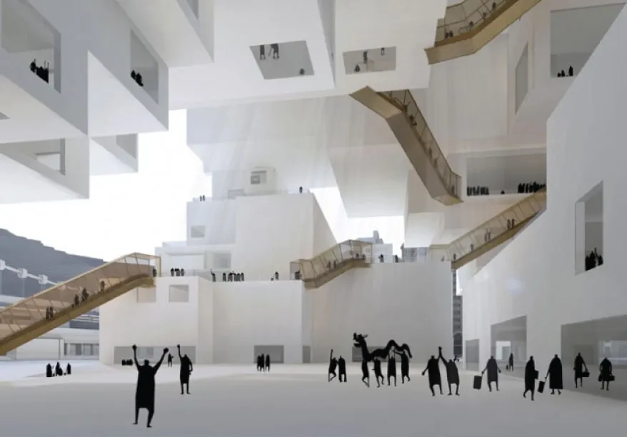
NL Architects (Interior from South view)
Our rendering (Interior from South view)
NL Architects (Interior from West view)
NL Architects (Interior from West view)
problem space
What methods can we use to best replicate a conceptual building with no exact measurements?
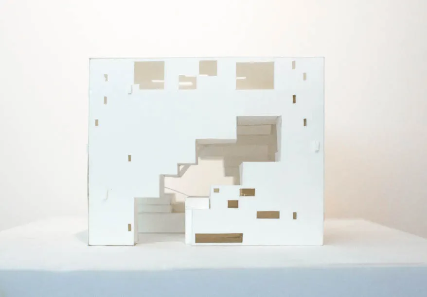
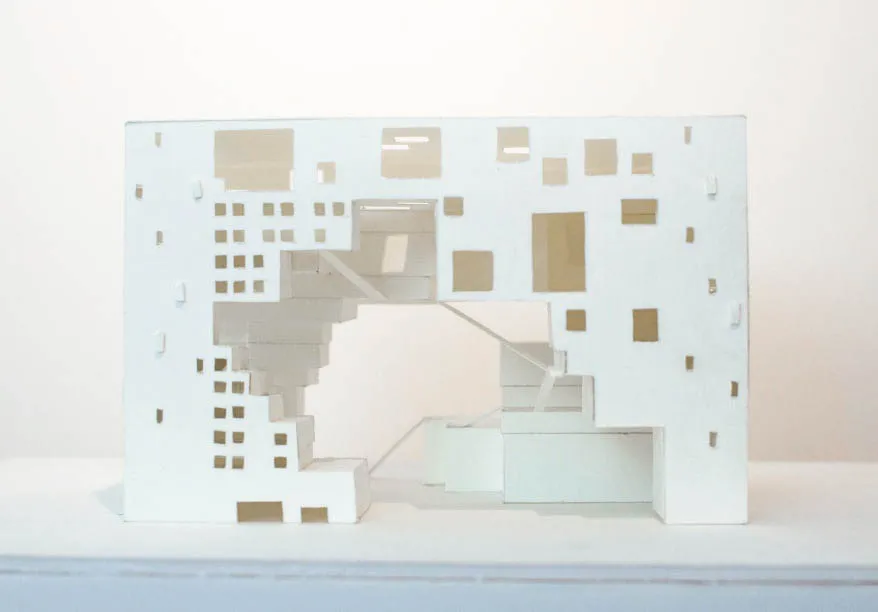
Assembly
Construction and faults
Our renderings were supported by mid-resolution images of NL Architects' envisioned floor plan. The lack of exact measurements resulted in our dimensions to be based off of aligning the four main views and the floor plan. Using these references, we guesstimated measurements that we felt were sensible to scale when translated into our model units.
As floors stack over time, it created construction faults and mismatch in propositions due to the lower quality of the blueprint photos and exact measurements. This is particularly noticeable when comparing the floor heights and the size of the interior escalators, as well as the unfilled interior volume. In NL Architects' rendering, their interior void is much more compact in comparison to ours.
Looking back on the project, there was also something that we missed. With the way the models were created, we didn't consider the thickness of walls. This was largely a behavior from working with a paper model first, which as the name implies, is paper thin. This is noticeable to the rendered interior South view's bottom right, where the walls meet the floor. Strangely, this visually appears the same in NL Architects' rendering, and only to this location, so it may simply be a rendering issue due to the lack of shadows creating a visible thickness.
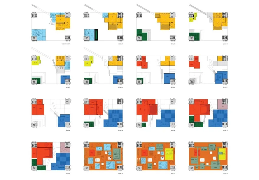
NL Architects' floor plans
Our floor assembly
Elevated view of the four legs (Missing floors 14 - 16)
Bottom view of the legs
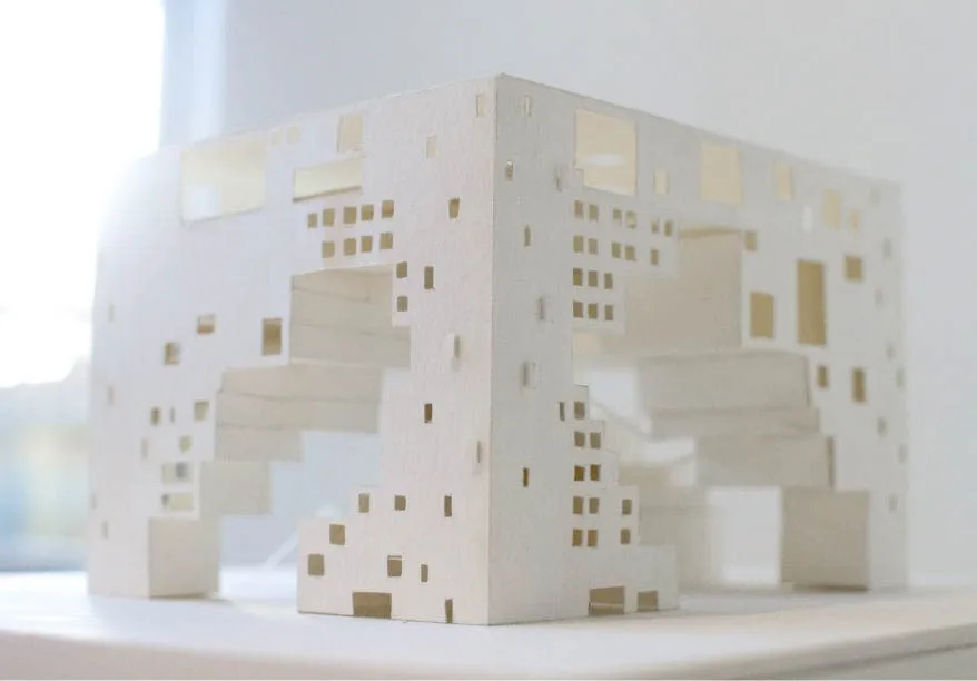
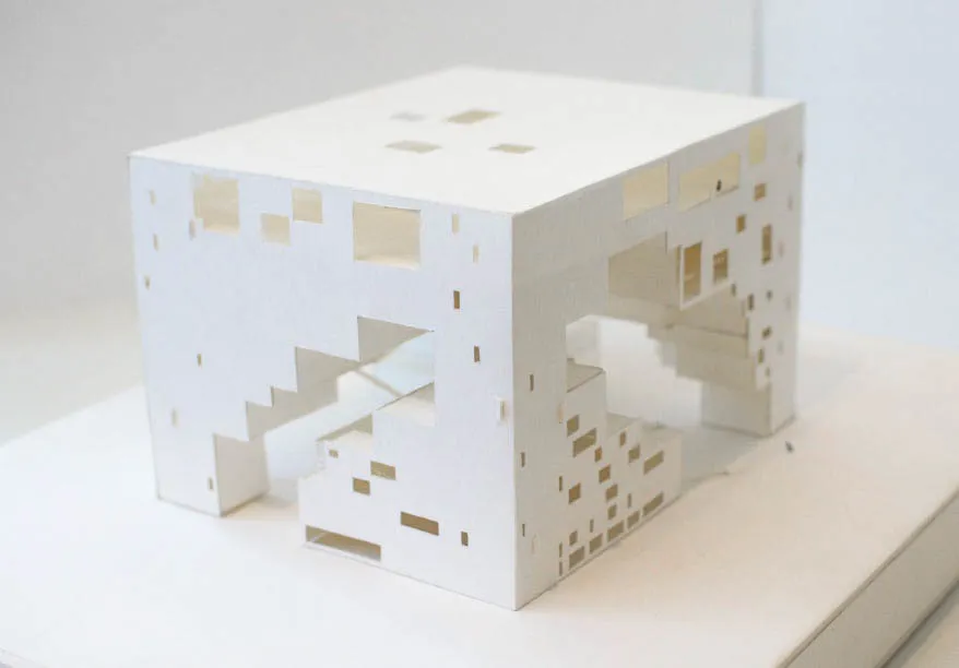
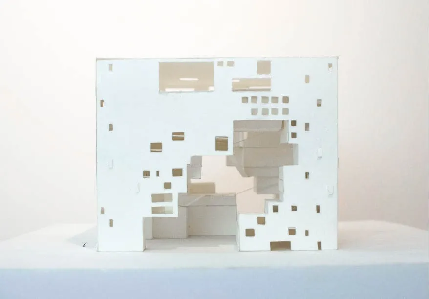
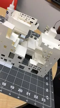
Physical build
Low-fidelity model
The following images represent the low-fidelity model that was completed alongside the digital renderings. The build requirements restricted construction material to paper, glue, and tape, but we refrained from using tape as it felt like it would detract from the cleanliness when binding edges.
Our paper choice was dictated by our need for rigidity in structural support, which we opted for thicker blotting paper. We appreciated the matteness as the glossiness from standard cardstock felt too shiny. The downside to this material was the force required to make clean cut lines due to its density - our index finger joints were crying. For binding, we used a combination of superglue for visible edges, and for interior portions that were hidden, we resorted to hot glue for its fast drying abilities.
Our paper choice was dictated by our need for rigidity in structural support, which we opted for thicker blotting paper. We appreciated the matteness as the glossiness from standard cardstock felt too shiny. The downside to this material was the force required to make clean cut lines due to its density - our index finger joints were crying. For binding, we used a combination of superglue for visible edges, and for interior portions that were hidden, we resorted to hot glue for its fast drying abilities.
Low-fidelity model (Northwest view)
Low-fidelity model (Southeast view)
Low-fidelity model (North view)
Low-fidelity model (East view)
Low-fidelity model (South view)
Low-fidelity model (West view)
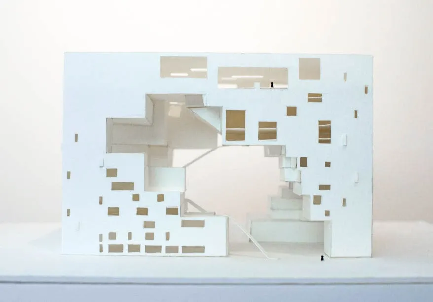
Physical build
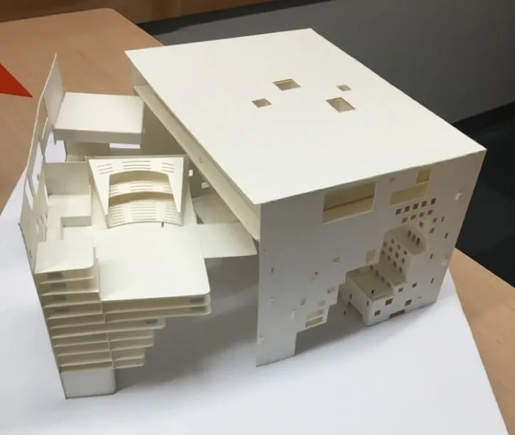
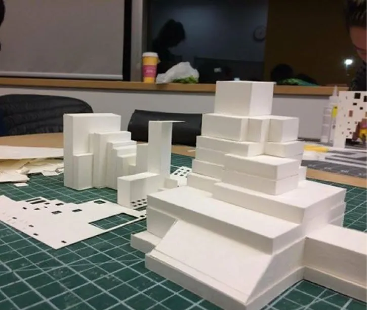
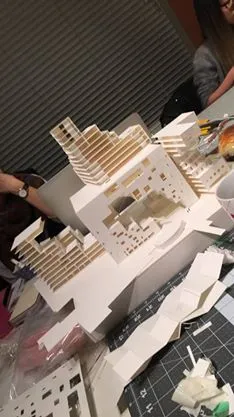
High-fidelity model
After having experienced the physical making of the first model, we were tasked again to create the same one but with a high-fidelity finish. We set out to bring additional elements that we were unable to do with the low-fidelity model. In the performance building brief, the stakeholders requested for architects to implement theatre venues, which NL Architects answered in their submission. We wanted our next model to focus on showing the interior aspects of this building, and thus, we decided to create a pull-out that would reveal the theatre spaces allotted within.
As the interior was the main focus, the stiff matteness of blotting paper would create too much resistance when trying to move the pull-out component. This time, cardstock supported our vision better as its glossiness and smoother finish would minimize drag. This allowed us to create an outer-casing, which would be built using one large piece of cardstock, moulded by scores. By creating a cast to encapsulate the interior, it provided for more wiggle room when interacting with the model.
As the interior was the main focus, the stiff matteness of blotting paper would create too much resistance when trying to move the pull-out component. This time, cardstock supported our vision better as its glossiness and smoother finish would minimize drag. This allowed us to create an outer-casing, which would be built using one large piece of cardstock, moulded by scores. By creating a cast to encapsulate the interior, it provided for more wiggle room when interacting with the model.
View of the Northeast pull-out
Construction of the exterior casing for the pull-out
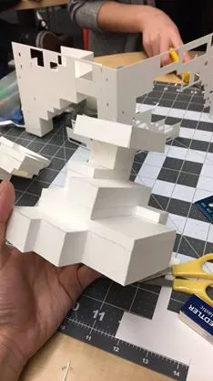
Pull-out shell
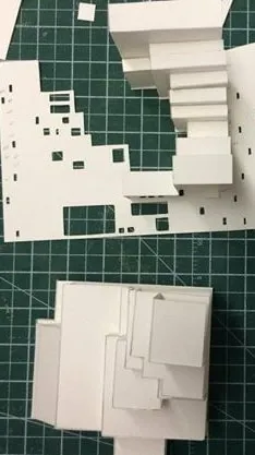
Aligning components
Arranging the model
Assembly of the full model
Reflections
Sometimes, all you need is a little pressure (read: a lot) to grow
The six weeks that were dedicated to this project were absolute chaos, and yet when I look back on it, I have nothing but fond memories. From the consecutive all-nighters, the stress-crying over construction, and the numbness our fingers endured when cutting with x-acto on dense paper, it really only fostered camaraderie.
A project feels different when there's a shared agreement to uphold an ethos of polish, care, and detailedness, and let's be honest, shared trauma. Because this class is really seen as a rite of passage for all design students, our outlook also came from the fear of failure and embarrassment. We did not want to see our models get binned or our printouts get shredded, because it's has happened in the history of this course. The fear we experienced truly imprinted the lesson of meticulousness and craftsmanship, even if we didn't always get it right. To this day, it still upholds an immense mindset in the work I do and present.
Beyond this six-week project, the full 14-weeks of the course also taught me how thoughtful design can impact its environment. Spatial design should take context and atmospheric cues from its community and immediate environment. A well-designed structure means that you cannot take it and plop it somewhere else. It would lose its significance. How does it weave with its immediate surroundings - the nature and the roads? Will the behavior and spaces around this structure? Who does it invite?
Have you ever consciously thought about how walking into a building made you feel? What sensations and smells did you experience? Were you greeted with a massive void or a narrow space? Was it light-filled or dim, loud or silent? It may not always be at the forefront, but there's always a decision behind the experiences you feel when you walk into a building. If I pursue the craft of Architecture one day, it will all be because of this one experience!
In the end, I confidently say that no single course has transformed me in the way of a designer and student as this one has. It taught me the principles behind strong design work - the intent and messaging, the central ideas both big and small, and the why it matters. It made me re-think what true polished work looks like and how to scrutinize not out of nitpickiness, but understanding how certain weaknesses can undermine the integrity of a greater whole. It also gave me a realization and feeling of being rallied among people who actually give a damn, because that can be hard to come by. It is an electrifying sensation that truly cannot be faked.
For all that, thank you, Russell Taylor.
Digital build
High-fidelity
I personally love 3D models and have a lot of fun exploring the textures and environment, so as a bonus, you can explore our digital rendering below, built exclusively with SketchUp! If the render preview doesn't load, you can also find the model here on 3D Warehouse.
© jeffrey chan, 2025.